Open
Set Subject
Judge's Comments
Prints
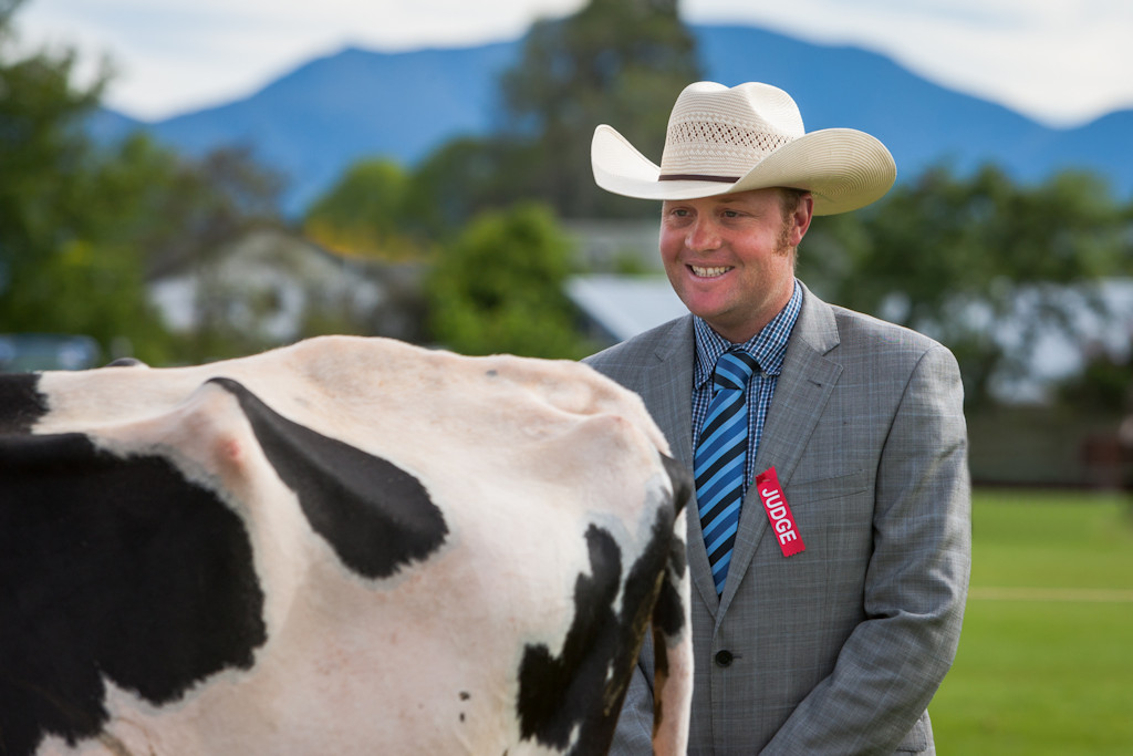
THE ‘A’ END – Good composition with the Judge on a strong third – good colour, but the white sky distracts somewhat – it would be better if you could darken it down a bit - I’d prefer the cow to be a bit sharper, however, the Judge is pin sharp and stands out against the fuzzy background – excellent work for a C Grader. HONOURS
MINER’S HUT, ARROWTOWN – nice, balanced composition – unfortunately, the main subject [the hut] is somewhat too dark, and is surrounded by trees and foreground all brightly lit – the hut look a bit two dimensional and flat – I’m sure with a bit of manipulation on the computer, you could lighten the doorway side of the house, thereby making it much stronger. ACCEPTED
TELLING YOU, I DON’T HAVE A REGO NUMBER – superb, muted colour – I vacillate between wanting a bit more space at the base and not wanting it – this is the way the author wanted it, so I guess we stick with that – pin sharp throughout – excellent, storytelling title. HONOURS
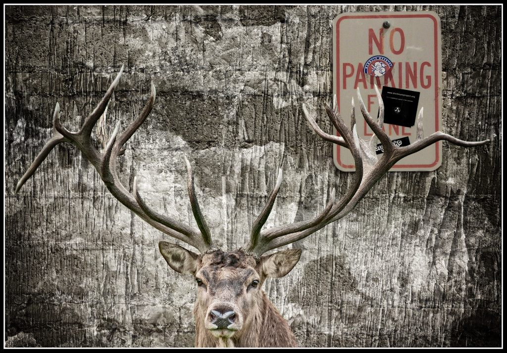
- great soft lighting emphasises the velvet quality of the animal’s hide – the horizontal lines make for an even more relaxed image – the animal is pin sharp and the background reasonably subdued – it looks so much like the old pompous colonel, taking his afternoon nap. MERIT
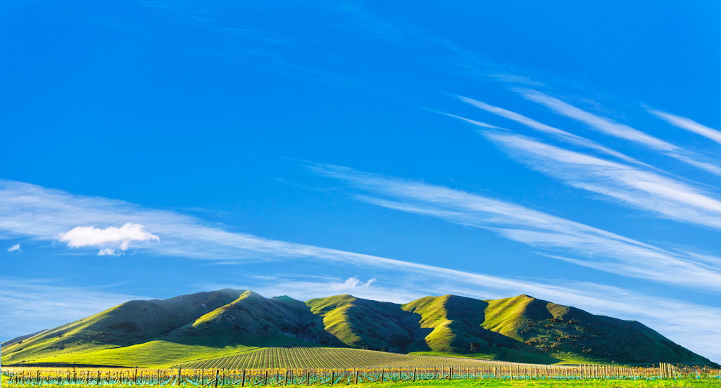
NOR WEST SKY – great sky – marvellous cross lighting throws the hills into high relief – the rows of plantings draw one’s eyes to the hills –– I’m not too keen on the colour of the sky – the blue seems to have a slight yellow caste - I love the very low horizon, which adds so much drama to the image. MERIT
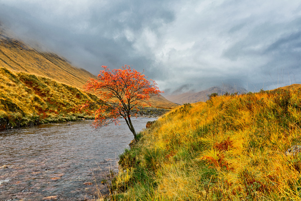
ETEVE AUTUMN – where do I start? – what wonderful colour throughout – also fabulous detail – the sky is brilliant – the tree is positioned perfectly – I wish it were mine. HONOURS
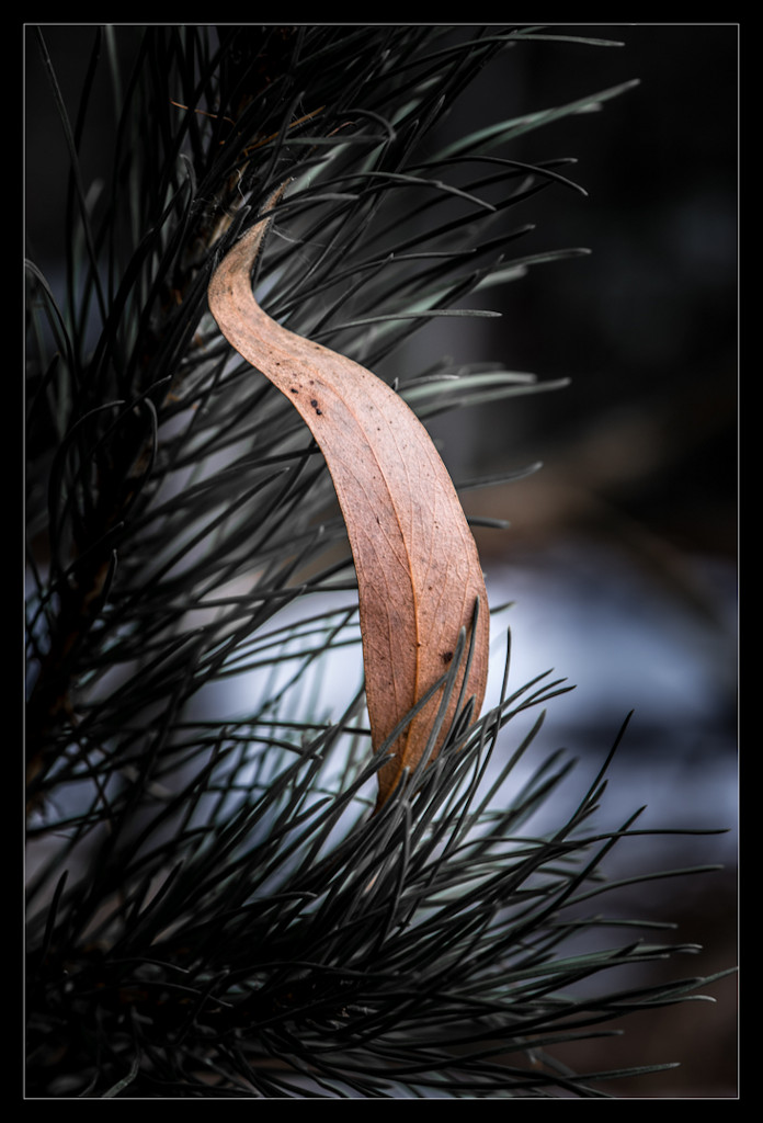
AND PINE – I like the way you have introduced a perfect S-Curve into this image – the texture of the gum leaf is shown well – the subtle lighting on the leaf and background really makes the leaf leap off the paper – as in the previous print, the velvety paper adds an extra dimension. MERIT
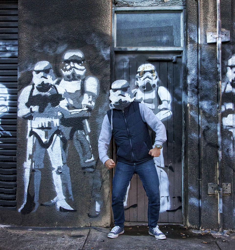
WANNA BE A STORM TROUPER – what a shame this was not in the Humour section – for me, it gets the biggest laugh of the evening – good colour – good composition – clever, subtle manipulation – might have cropped off the downpipe on the right, just to balance the composition a bit more – well done. HONOURS
BUILT FOR COMFORT – that’s for sure – very good balanced composition – subtle lighting has created a small cocoon of light in which the sulkies nestle – I’m surprised an A Grader has left those dots of light coming through the wall at the top right – they should really be eliminated – oh dear, the front contraption looks really uncomfortable for both horse and driver. ACCEPTED
BRIDGE – I’m sorry, but in opinion, this just isn’t up to standard – there’s not sufficient light to raise it out of the murky gloom – one can only just see the bridge and it is overwhelmed by the bright lights at each side and the blue structures on the left. NOT ACCEPTED
DIGITAL IMAGES
YOU GO FIRST – brilliant title – great colour – the birds are sharp and stand out against the background – I love the monochromeness [is that even a word?] of it, with just the vivid yellow dots – somehow you’ve even managed to get a terrific grouping of 2 and 1, so the composition is well balanced. HOURS
RIVER – I guess the owners of the house didn’t see the funny side of this image – but with our dry feet we can see the irony of the sign – interesting lighting – however the pole is just too central to make a balanced composition – nicely saturated colour. ACCEPTED
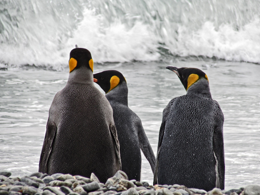
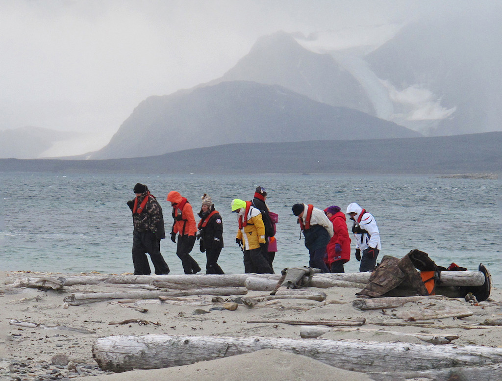
PAID TO COME HERE – now we see where the penguins came from – that is sooo cold – I like the murkiness of the background and the hunched attitude of the people – all that says I’m frozen – the bright colours stand out against the monochromatic surroundings. MERIT
AT THE STORM – beautifully balanced composition, with the planes near a strong third – colourwise, the sky is subdued, but it is still menacing – the planes look so small in that vast space – small and insignificant – however, they still rule the sky. ACCEPTED
OFF – oh yes, I see this several times a day around here – my idiot cat seems to manage to see all the others off the property, without damage to herself – beautiful backlighting highlights the whiskers yet still leaves plenty of detail on their faces – I’m pretty sure you’ve tried some cloning on the lower right hand side, and it shows – work on that technique a bit more – I wish you had lifted the camera just a tad, so the end of the whiskers were included – this would also reduce the area above the cats, making for a more balanced composition. ACCEPTED
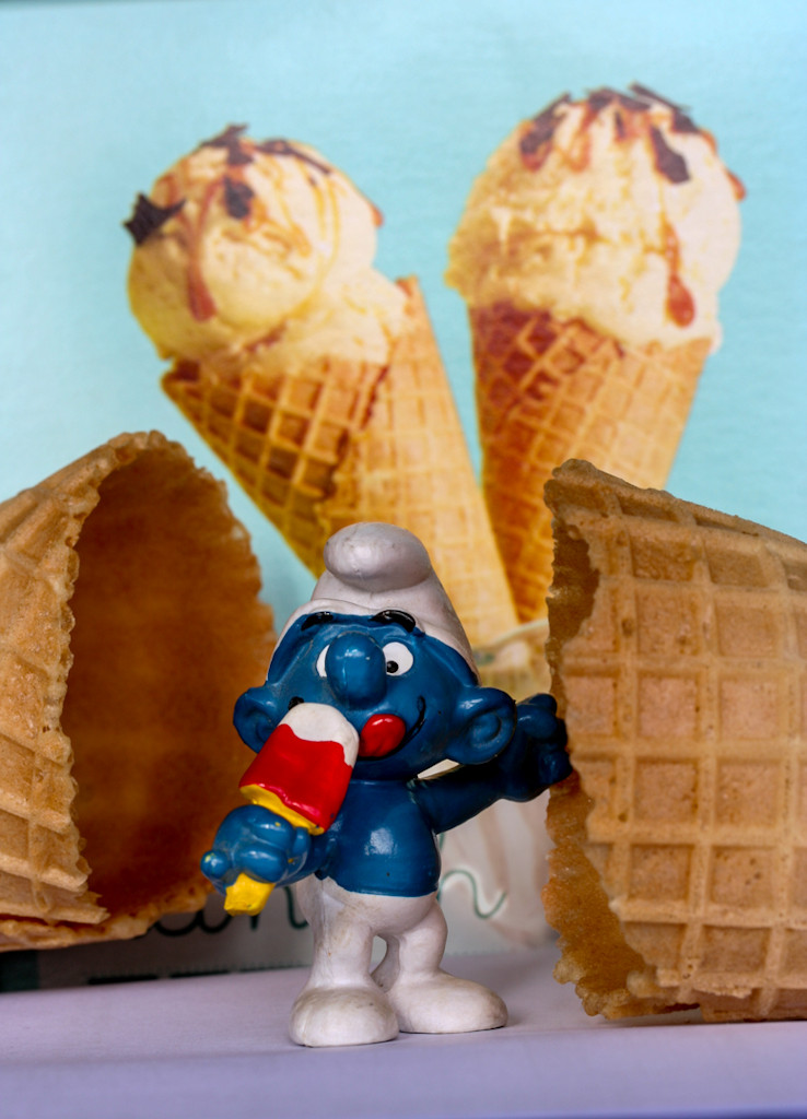
FOUND THE FACTORY – plenty of creativity here – and plenty of humour – great colour and well composed – I do wish I could see his other eye more – the Smurf and foreground cones are sharp, putting the emphasis on them, which is, of course, what you want. MERIT
OF BUBBLES – all the movement in the child adds to the excitement – I think there may be a bit of camera shake in there as well – but I don’t care in this case, because the bubbliness is what it’s all about – I would crop both sides to make this a vertical format – it would be a stronger image that way. ACCEPTED
POMS – unfortunately the two dogs merge into each other in places, making it difficult to differentiate them – however, the title is ‘Pom Poms’ not ‘Dogs with Pom Poms’ – it could be a tad crisper and I’d like the lowest pom pom to be completely included – but it is still a fun image and is full of good blacks and whites. ACCEPTED
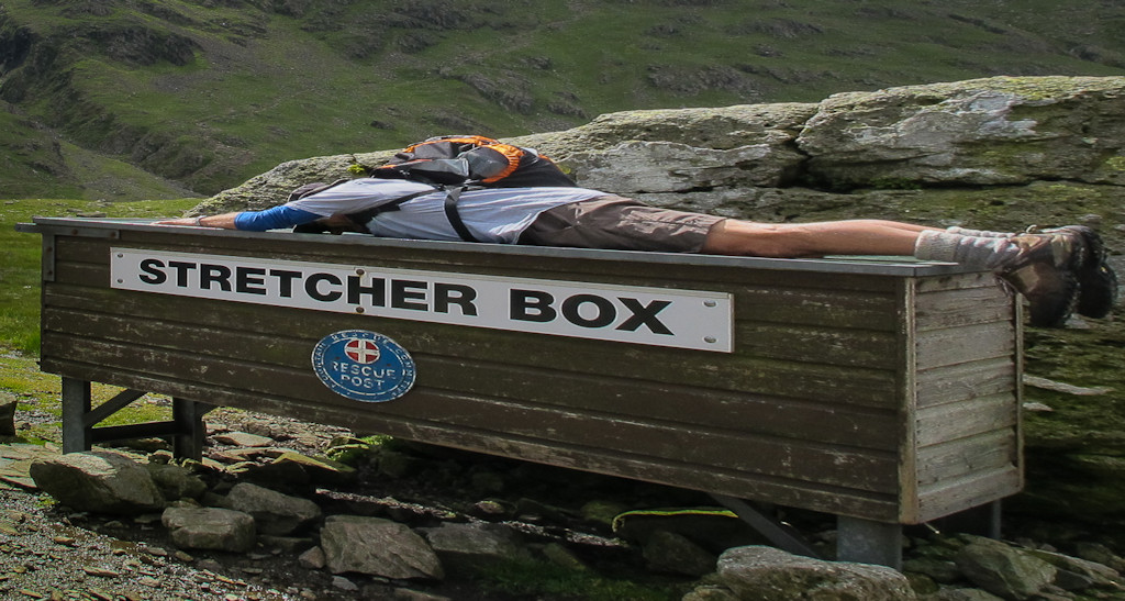
RACK – what a hoot – well done for seeing the other interpretation of stretcher – good lighting, nice and sharp and well composed. MERIT
OF A KIND – well thought out title, even if it is a bit unkind – although the brown parts of the dog and the blue trousers are well detailed, the grass is a bit washed out and the dog’s white areas are almost completely blank – good connection between the two. ACCEPTED
ARE ALL WINNERS – you need a bit of bounce light on the back of the Smurf, to make it stand out more – I really think a B Grader would be more knowledgeable on the subject – sorry, that sounds very harsh and I don’t mean to be – I’m glad you are trying out new things, keep going – I note both eyes are visible here – much better. NOT ACCEPTED
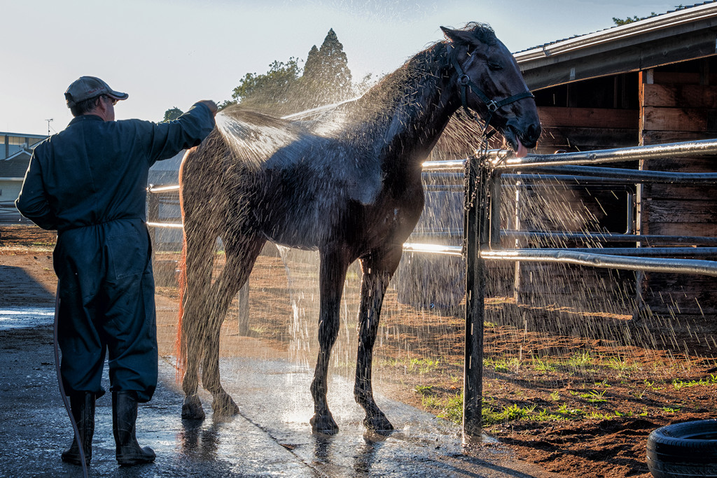
OR ECSTACY – I wonder what that guy would think if the horse turned the hose on him! – I would have cropped off the tyre at the bottom right, as it’s a tad distracting – the back lighting is brilliant – it shows the water so well, but still leaves plenty of detail – pity about the blank sky. MERIT
IN THERE SOMEWHERE – this is quite a nice portrait, with excellent lighting, if only you hadn’t tried to be funny – the highlight on the hair allows the head to stand out, while letting the jumper to merge with the background – pity his glasses are obscuring the catchlight in his left eye – it is well composed, with the eyes above the centre line. ACCEPTED
HANGING OUT AT THE BEACH – all the action is crammed into the far left quarter, with nothing relating to humour anywhere else – if you cropped off all of the right hand hill, the whole image becomes simpler and more balanced – good depth of colour. ACCEPTED
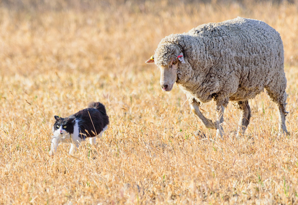
CRAP! – this is not a perfect picture, but it makes me laugh out loud – the sheep is just being a sheep, but the cat!! – the grasses are the merest smidgen too light, but the composition is balanced and both animals are sharp. HONOURS
ON MOWER – this has a full range of tones, from white, through all the greys, to rich black – the child is very central and I would crop off from the left, almost to the back wheel of the mower – while the background is subdued, it’s a bit messy along the top of the grasses. ACCEPTED
– a charming image of horse and girl – nice soft lighting gives plenty of detail – background is nicely subdued – I’d crop off some from the left to concentrate more on the main subjects – descriptive title. ACCEPTED
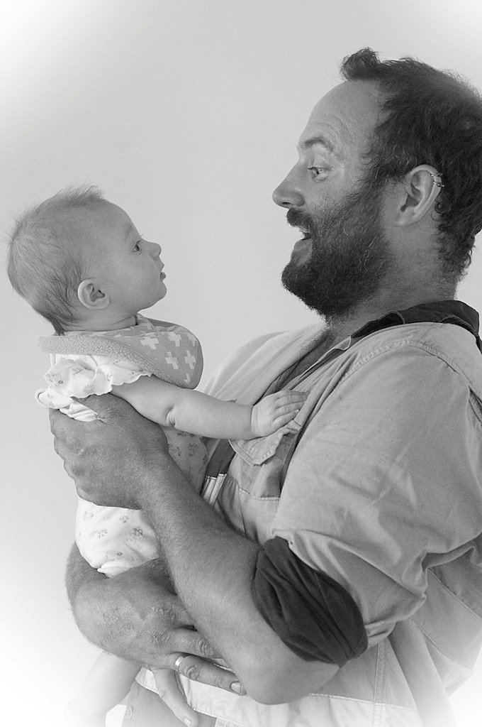
HAPPY, NOT! – poor wee soul – how long did you leave your daughter crying her heart out? – again we have the soft lighting, so suitable for this delicate subject – well composed – a delightful image. ACCEPTED
IS GONNA’ BE CLOSE! – from this perspective, they are close, but I didn’t hear of any crash in the sounds so they must have room – However I really don’t think this is up to A Grade standard. NOT ACCEPTED
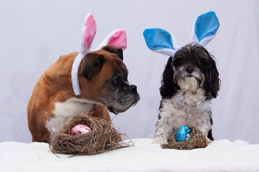
LOOKS BETTER THAN MINE – well done to get the dogs to co-operate – even though they are wearing those ridiculous ears! – how embarrassing for them – and well done with the appropriate title – the dogs are pin sharp and delicately lit. MERIT
– it seems rather gloomy, but I suppose with that sky, it would be – the boats appear strung out and disconnected, with little cohesive composition – I think you could do better, even in the weather conditions. NOT ACCEPTED
AT HOME – very curious lighting has been used here – and I can’t say I like it very much – because of the lighting, the background is too clear and very distracting – the face is very compelling – the texture is great and the skin tones are rich – somehow subdue the background and, in my opinion, you’d have a winner. ACCEPTED
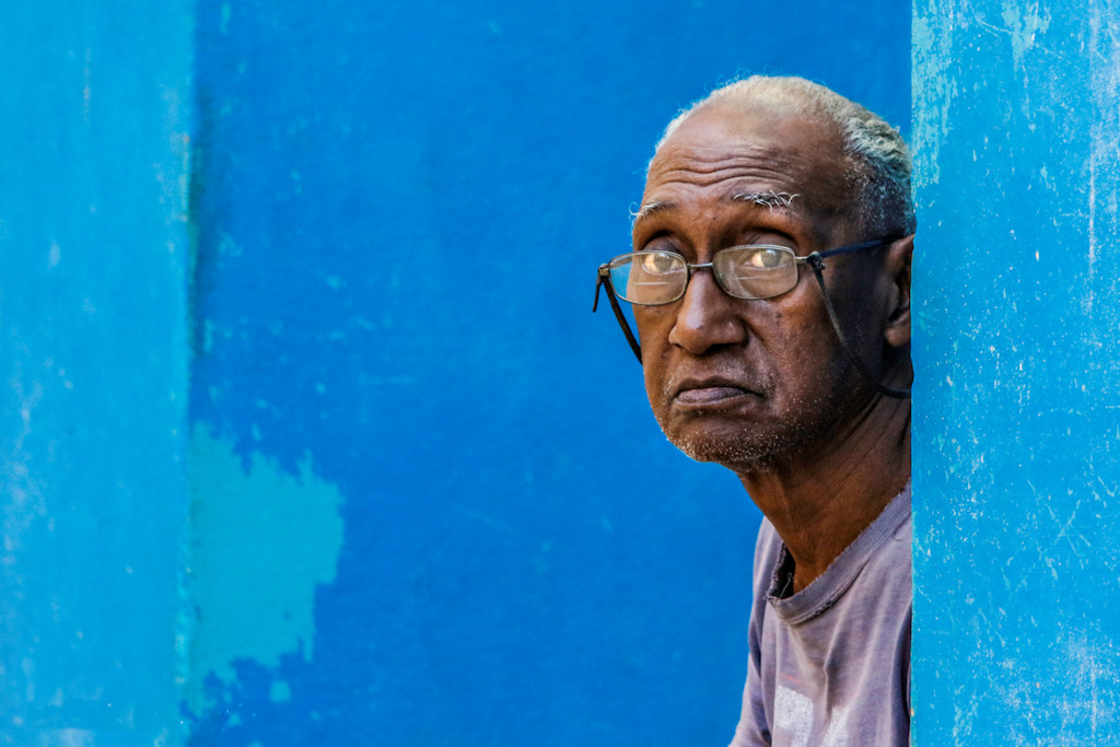
PORTRAIT – HAVANA – this just leaps off the screen – it’s simple, almost stark – simple colours – he’s on the strong third and his eyes are above the centre line – well done. HONOURS
WHO ARE YOU! – great expressions on both people – and strong interaction between them – you maybe could up the contrast just a smidgen – just to give it a bit more punch - well balanced composition. MERIT
WHERE IS HE – a rather harsh portrait – she’s on the wrong side of the frame – she should be on the left and looking INto the picture – with her black dress disappearing into the background, she is just a dismembered head and one and a half arms looming out of the darkness. NOT ACCEPTED
MANDARIN WATERFOWL - This is an extremely beautiful bird – the colours are accurate and it’s sharp as a tack – however, it is rather small in the frame and dead centre – a crop off the left hand side would make the image more balanced ACCEPTED
Share: